Bootstrap Panel Group
Overview
Sometimes we need to segregate some small (or not so much) parts of information to force them stand up and get the client's focus-- such as mentioning certain helpful features showing a listing of articles with a small extract and a single powerful picture and so on and on.
We need an efficient tool to beautifully wrap our content in a lovely and responsive manner to have it favorable and neat presented on our webpages. In the last version of the remarkably popular flexible framework-- Bootstrap 3 we employed mostly the Bootstrap Panel Body, thumbnail and well elements providing us box containers along with a slight border, slightly elliptical edges and eventually-- a light 3d effect. In the latest Bootstrap 4 framework, these are no more. They get got changed altogether by the card part declaring to be worthy of pretty much whatever the previous features can do but only much better. It's time to get to know it more thoroughly.
Methods to employ the Bootstrap Panel Example:
The cards are lightly styled boxes capable of carrying almost any HTML content in them also having a lot of predefined styling choice for correctly showcasing its article. It in addition optionally might have a footer and a header.
The contextual color scheme classes could be employed to additionally design your whole card elements quickly-- simply add a .card- ~ one of the contextual colours here like primary, success, info or danger here ~ to the primary .card wrapper and if the background becomes a bit overly dim for the content to be distinct enough-- also add the .card-inverse class to invert the text color. You can also design only the line colour using the contextual palette-- this gets done by adding the .card-outline- ~ the required colour ~ class again to the main .card item.
As mentioned above the .card-block appears to cover the content keeping a pretty padding around it. However when it comes to pictures this might wish to avoid this and have the pic spread the whole width of the element.
To have this appearance just place the <div class="img"><img></div> tag outside the .card-block so you avoid the paddings eventually adding style=" width:100%;" making certain this is going to resize correctly always filling in its container.
A few words about the design-- cards will occupy the entire horizontal spot available by default thus it's a good idea limiting it by putting them inside some grid elements. This way you can achieve their expected actions.
Some case
Cards are built with as minimal markup and styles as possible, but still handle to deliver a ton of control and modification. Built with flexbox, they offer easy positioning and blend well with other Bootstrap components.
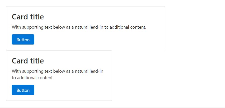
Here is an illustration of a simple card with blended content and a set width. Cards have no precise width to start, so they'll typically occupy the full width of its parent section. This is simply individualized with many sizing choices.
<div class="card" style="width: 20rem;">
  <div class="img"><img class="card-img-top" src="..." alt="Card picture caption"></div>
  <div class="card-block">
    <h4 class="card-title">Card caption</h4>
    <p class="card-text">Some fast sample message to build on the card title as well as compose the bulk of the card's material.</p>
    <a href="#" class="btn btn-primary">Go somewhere</a>
  </div>
</div>
Web site information types
Cards maintain a wide assortment of content, involving pictures, text message, list collections, urls, and more. Here are samples of what's supported.
Blocks
The building block of a card is the .card-block. Use it whenever you demand a padded section within a card.
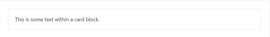
<div class="card">
  <div class="card-block">
    This is some message in a card block.
  </div>
</div>
Names, message, and web links
Card titles are employed by adding .card-title to a <h*> tag. In the same way, urls are added and installed close to each other by including .card-link to a <a> tag.
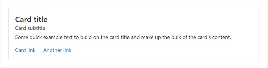
<div class="card">
<div class="card-block">
<h4 class="card-title">Card title</h4>
<h6 class="card-subtitle mb-2 text-muted">Card subtitle</h6>
<p class="card-text">Some fast example message to improve the card title and compose the mass of the card's content.</p>
<a href="#" class="card-link">Card link</a>
<a href="#" class="card-link">Another link</a>
</div>
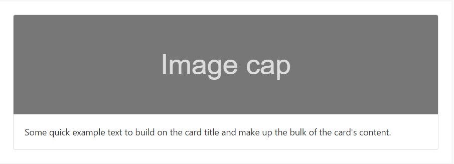
</div>Images
.card-img-top places an image to the very top of the card. With .card-text, text can be added to the card. Text within .card-text can also be styled with the regular HTML tags.
<div class="card">
  <div class="img"><img class="card-img-top" src="..." alt="Card picture cap"></div>
  <div class="card-block">
    <p class="card-text">Some fast example message to build on the card title and also compose the bulk of the card's web content.</p>
  </div>
</div>
Listing groups
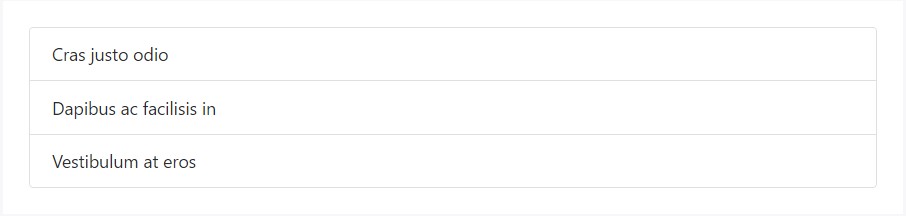
Make lists of content in a card using a flush list group.
<div class="card">
<ul class="list-group list-group-flush">
<li class="list-group-item">Cras justo odio</li>
<li class="list-group-item">Dapibus ac facilisis in</li>
<li class="list-group-item">Vestibulum at eros</li>
</ul>
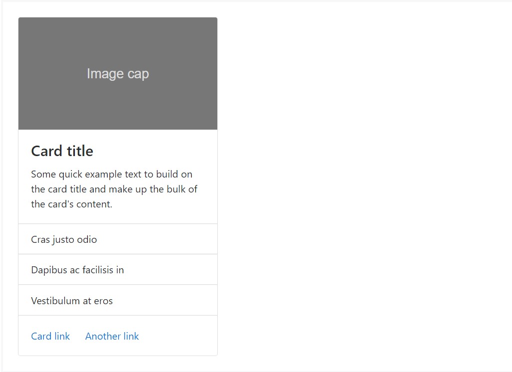
</div>Mix up and go with several content kinds to generate the card you wish, or throw everything in there. Presented here are picture styles, blocks, text message looks, plus a list group - all wrapped in a fixed-width card.
<div class="card" style="width: 20rem;">
  <div class="img"><img class="card-img-top" src="..." alt="Card image cap"></div>
  <div class="card-block">
    <h4 class="card-title">Card title</h4>
    <p class="card-text">Some quick example text to build on the card title and make up the bulk of the card's content.</p>
  </div>
  <ul class="list-group list-group-flush">
    <li class="list-group-item">Cras justo odio</li>
    <li class="list-group-item">Dapibus ac facilisis in</li>
    <li class="list-group-item">Vestibulum at eros</li>
  </ul>
  <div class="card-block">
    <a href="#" class="card-link">Card link</a>
    <a href="#" class="card-link">Another link</a>
  </div>
</div>
Header and footer
Include an extra header and/or footer inside a card.
<div class="card">
<div class="card-header">
Featured
</div>
<div class="card-block">
<h4 class="card-title">Unique title therapy</h4>
<p class="card-text">With supporting message below as an all-natural lead-in to extra content.</p>
<a href="#" class="btn btn-primary">Go someplace</a>
</div>
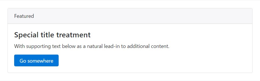
</div>Card headers can be styled by including .card-header to <h*> sections.
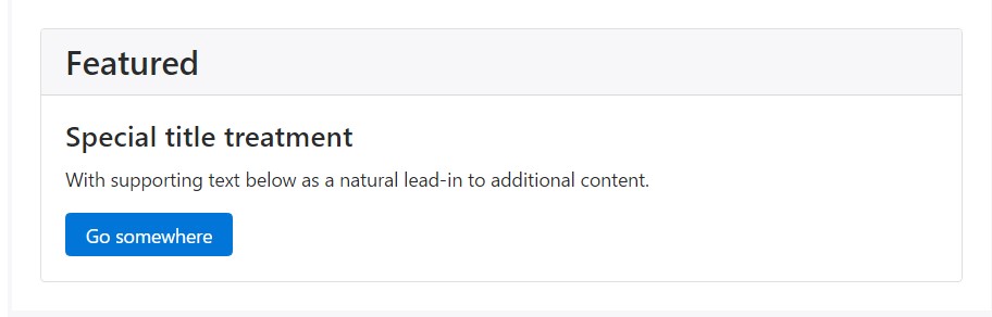
<div class="card">
  <h3 class="card-header">Featured</h3>
  <div class="card-block">
    <h4 class="card-title">Special title treatment</h4>
    <p class="card-text">With supporting message below as a natural lead-in to extra content.</p>
    <a href="#" class="btn btn-primary">Go someplace</a>
  </div>
</div>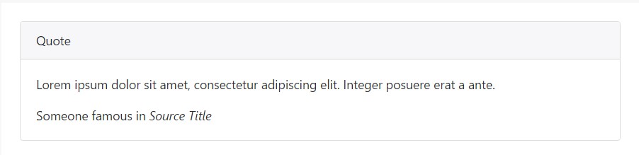
<div class="card">
  <div class="card-header">
    Quote
  </div>
  <div class="card-block">
    <blockquote class="card-blockquote">
      <p>Lorem ipsum dolor sit amet, consectetur adipiscing elit. Integer posuere erat a ante.</p>
      <footer>Someone famous in <cite title="Source Title">Source Title</cite></footer>
    </blockquote>
  </div>
</div>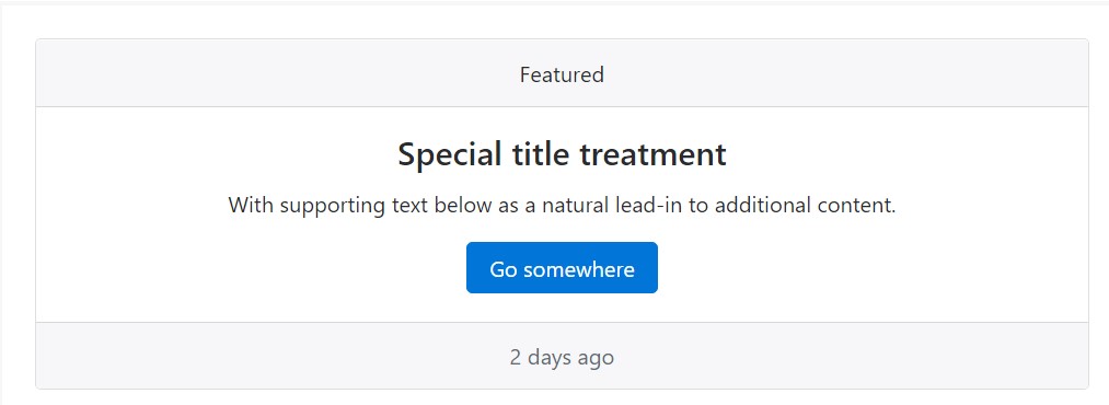
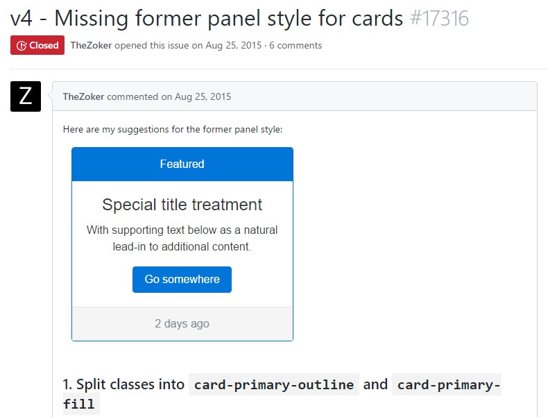
<div class="card text-center">
  <div class="card-header">
    Featured
  </div>
  <div class="card-block">
    <h4 class="card-title">Special title treatment</h4>
    <p class="card-text">With supporting text below as an all-natural lead-in to extra material.</p>
    <a href="#" class="btn btn-primary">Go someplace</a>
  </div>
  <div class="card-footer text-muted">
    2 days ago
  </div>
</div>
Proportions
Cards have no specified width to begin, so they'll be 100% wide unless something else declared. You can alter this as required with custom CSS, grid classes, grid Sass mixins, or utilities.
Applying grid markup
Making use of the grid, wrap cards in columns and rows as wanted.
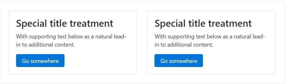
<div class="row">
<div class="col-sm-6">
<div class="card">
<div class="card-block">
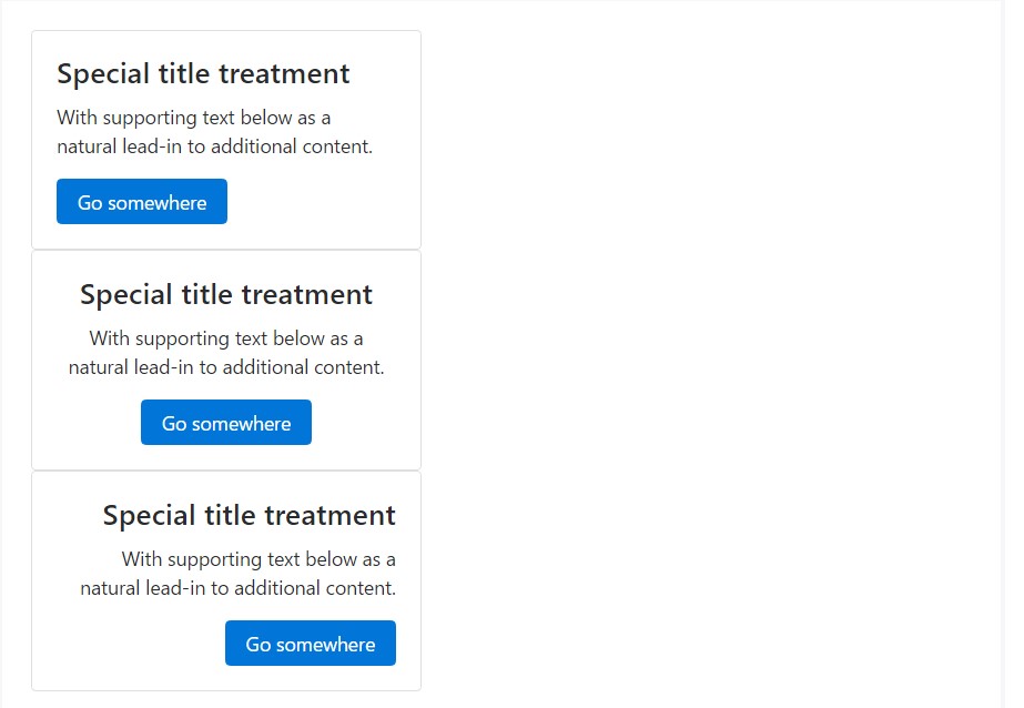
<h3 class="card-title">Special title treatment</h3>
<p class="card-text">With supporting text below as a natural lead-in to additional content.</p>
<a href="#" class="btn btn-primary">Go somewhere</a>
</div>
</div>
</div>
<div class="col-sm-6">
<div class="card">
<div class="card-block">
<h3 class="card-title">Special title treatment</h3>
<p class="card-text">With supporting text below as a natural lead-in to additional content.</p>
<a href="#" class="btn btn-primary">Go somewhere</a>
</div>
</div>
</div>
</div>Using utilities
Use handful of available sizing utilities to quickly establish a card's width.
<div class="card w-75">
  <div class="card-block">
    <h3 class="card-title">Card title</h3>
    <p class="card-text">With supporting text below as a natural lead-in to additional content.</p>
    <a href="#" class="btn btn-primary">Button</a>
  </div>
</div>

<div class="card w-50">
  <div class="card-block">
    <h3 class="card-title">Card title</h3>
    <p class="card-text">With sustaining message listed below as an all-natural lead-in to extra web content.</p>
    <a href="#" class="btn btn-primary">Button</a>
  </div>
</div>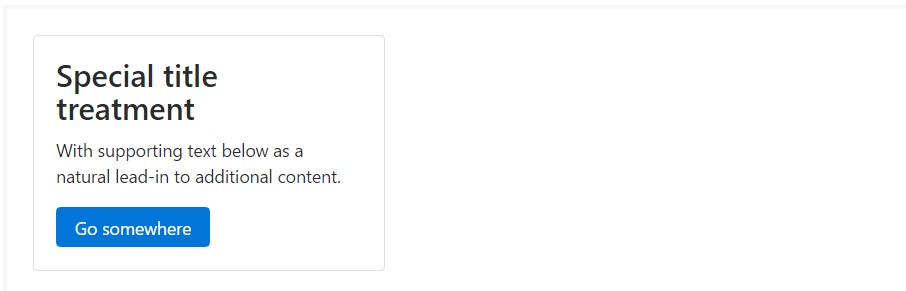
<div class="card" style="width: 20rem;">
  <div class="card-block">
    <h3 class="card-title">Special title treatment</h3>
    <p class="card-text">With supporting text below as a natural lead-in to added material.</p>
    <a href="#" class="btn btn-primary">Go somewhere</a>
  </div>
</div>
Information placing
You can rapidly alter the message positioning of any card-- in its entirety or particular parts-- with text align classes.
<div class="card" style="width: 20rem;">
  <div class="card-block">
    <h4 class="card-title">Special title treatment</h4>
    <p class="card-text">With supporting text below as a natural lead-in to additional content.</p>
    <a href="#" class="btn btn-primary">Go somewhere</a>
  </div>
</div>

<div class="card text-center" style="width: 20rem;">
  <div class="card-block">
    <h4 class="card-title">Special title treatment</h4>
    <p class="card-text">With supporting text below as a natural lead-in to additional content.</p>
    <a href="#" class="btn btn-primary">Go somewhere</a>
  </div>
</div>

<div class="card text-right" style="width: 20rem;">
  <div class="card-block">
    <h4 class="card-title">Special title treatment</h4>
    <p class="card-text">With supporting text below as a natural lead-in to additional content.</p>
    <a href="#" class="btn btn-primary">Go somewhere</a>
  </div>
</div>
Web site navigation
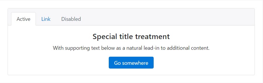
Include some navigation to a card's header (or block) with Bootstrap's nav elements.
<div class="card text-center">
  <div class="card-header">
    <ul class="nav nav-tabs card-header-tabs">
      <li class="nav-item">
        <a class="nav-link active" href="#">Active</a>
      </li>
      <li class="nav-item">
        <a class="nav-link" href="#">Link</a>
      </li>
      <li class="nav-item">
        <a class="nav-link disabled" href="#">Disabled</a>
      </li>
    </ul>
  </div>
  <div class="card-block">
    <h4 class="card-title">Special title treatment</h4>
    <p class="card-text">With supporting text below as a natural lead-in to additional content.</p>
    <a href="#" class="btn btn-primary">Go somewhere</a>
  </div>
</div>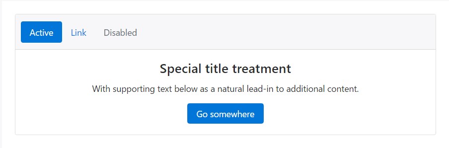
<div class="card text-center">
<div class="card-header">
<ul class="nav nav-pills card-header-pills">
<li class="nav-item">
<a class="nav-link active" href="#">Active</a>
</li>
<li class="nav-item">
<a class="nav-link" href="#">Link</a>
</li>
<li class="nav-item">
<a class="nav-link disabled" href="#">Disabled</a>
</li>
</ul>
</div>
<div class="card-block">
<h4 class="card-title">Special title treatment</h4>
<p class="card-text">With supporting text below as a natural lead-in to additional content.</p>
<a href="#" class="btn btn-primary">Go somewhere</a>
</div>
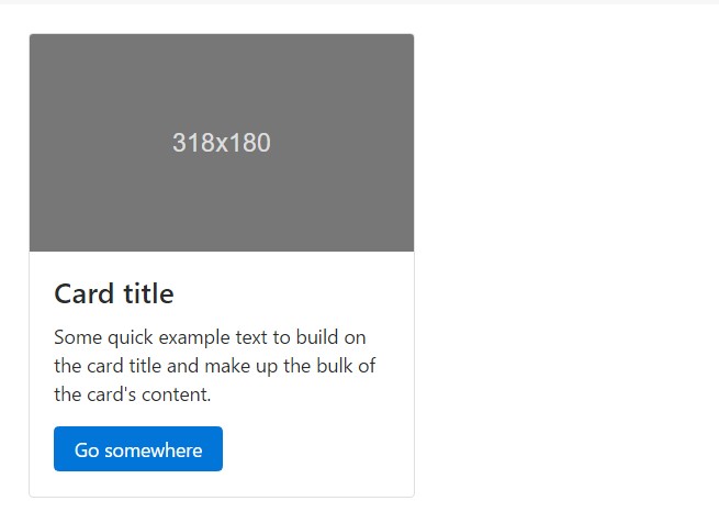
</div>Pictures
Cards feature a number of features for operating using images. Select from adding "image caps" at possibly end of a card, overlaying pics with card content, or simply installing the image in a card.
Illustration caps
Similar to headers and footers, cards may feature top and bottom "image caps"-- pics at the top or bottom of a card.
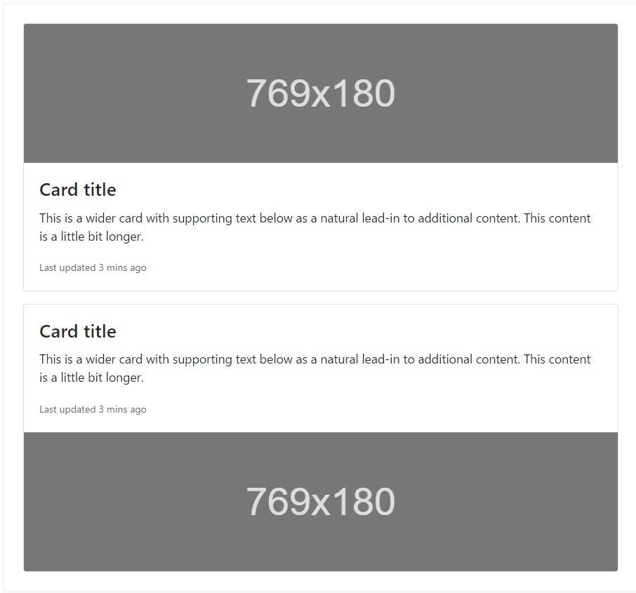
<div class="card mb-3">
  <div class="img"><img class="card-img-top" src="..." alt="Card image cap"></div>
  <div class="card-block">
    <h4 class="card-title">Card title</h4>
    <p class="card-text">This is a wider card with supporting text below as a natural lead-in to additional content. This content is a little bit longer.</p>
    <p class="card-text"><small class="text-muted">Last updated 3 mins ago</small></p>
  </div>
</div>
<div class="card">
  <div class="card-block">
    <h4 class="card-title">Card title</h4>
    <p class="card-text">This is a wider card with supporting text below as a natural lead-in to additional content. This content is a little bit longer.</p>
    <p class="card-text"><small class="text-muted">Last updated 3 mins ago</small></p>
  </div>
  <div class="img"><img class="card-img-bottom" src="..." alt="Card image cap"></div>
</div>
Image cover
Turn an illustration into a card background and overlay your card's text. Depending on the image, you may or may not require .card-inverse (see below).
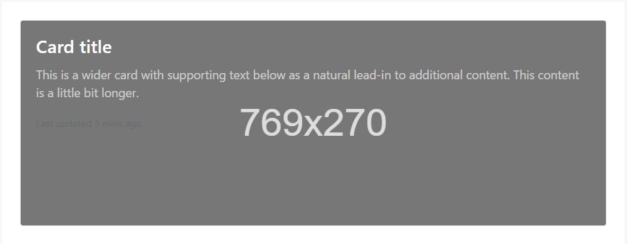
<div class="card card-inverse">
  <div class="img"><img class="card-img" src="..." alt="Card image"></div>
  <div class="card-img-overlay">
    <h4 class="card-title">Card title</h4>
    <p class="card-text">This is a wider card with supporting text below as a natural lead-in to additional content. This content is a little bit longer.</p>
    <p class="card-text"><small class="text-muted">Last updated 3 mins ago</small></p>
  </div>
</div>
Card variations
Cards utilize different alternatives for customizing their backgrounds, borders, and color.
Inverted text message
By default, cards use dark text and expect a light background. You can change that by toggling the color of text within, as well as that of the card's subcomponents, using .card-inverse. Specify a dark background-color and border-color to go with it.
You may also use .card-inverse having the contextual backgrounds variants.
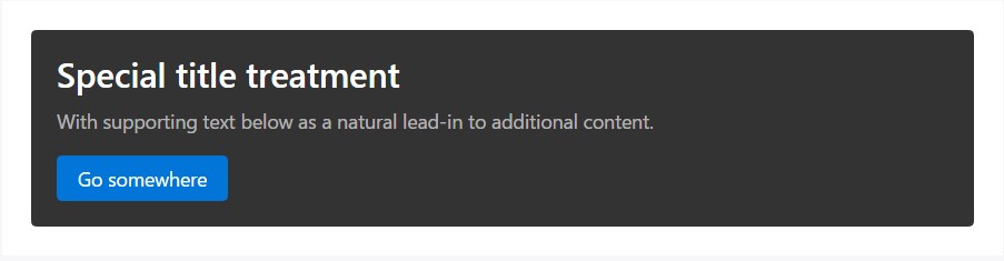
<div class="card card-inverse" style="background-color: #333; border-color: #333;">
  <div class="card-block">
    <h3 class="card-title">Special title treatment</h3>
    <p class="card-text">With supporting text below as a natural lead-in to additional content.</p>
    <a href="#" class="btn btn-primary">Go somewhere</a>
  </div>
</div>
Background variants
Cards feature their own variant classes for quickly modifying the background-color and border-color of a card. Darker colors require the use of .card-inverse.
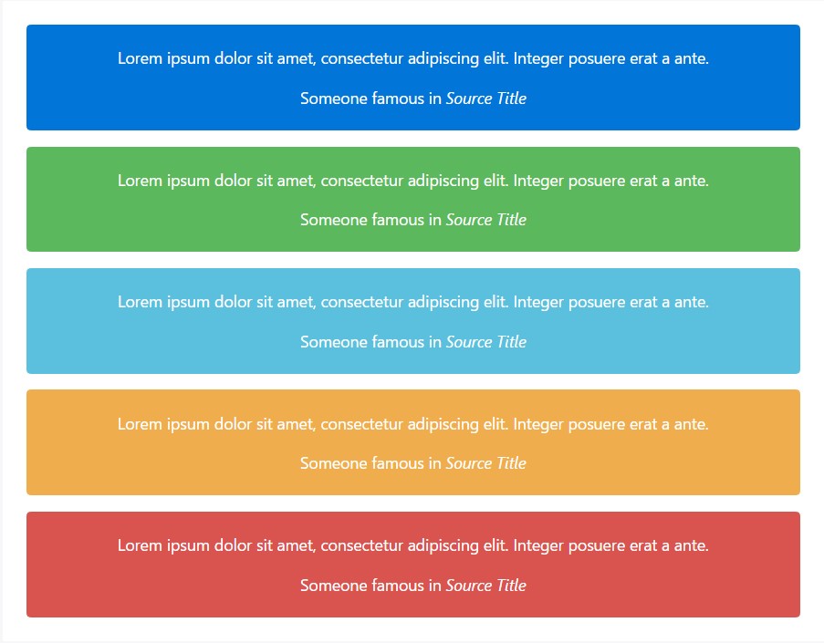
<div class="card card-inverse card-primary mb-3 text-center">
  <div class="card-block">
    <blockquote class="card-blockquote">
      <p>Lorem ipsum dolor sit amet, consectetur adipiscing elit. Integer posuere erat a ante.</p>
      <footer>Someone famous in <cite title="Source Title">Source Title</cite></footer>
    </blockquote>
  </div>
</div>
<div class="card card-inverse card-success mb-3 text-center">
  <div class="card-block">
    <blockquote class="card-blockquote">
      <p>Lorem ipsum dolor sit amet, consectetur adipiscing elit. Integer posuere erat a ante.</p>
      <footer>Someone famous in <cite title="Source Title">Source Title</cite></footer>
    </blockquote>
  </div>
</div>
<div class="card card-inverse card-info mb-3 text-center">
  <div class="card-block">
    <blockquote class="card-blockquote">
      <p>Lorem ipsum dolor sit amet, consectetur adipiscing elit. Integer posuere erat a ante.</p>
      <footer>Someone famous in <cite title="Source Title">Source Title</cite></footer>
    </blockquote>
  </div>
</div>
<div class="card card-inverse card-warning mb-3 text-center">
  <div class="card-block">
    <blockquote class="card-blockquote">
      <p>Lorem ipsum dolor sit amet, consectetur adipiscing elit. Integer posuere erat a ante.</p>
      <footer>Someone famous in <cite title="Source Title">Source Title</cite></footer>
    </blockquote>
  </div>
</div>
<div class="card card-inverse card-danger text-center">
  <div class="card-block">
    <blockquote class="card-blockquote">
      <p>Lorem ipsum dolor sit amet, consectetur adipiscing elit. Integer posuere erat a ante.</p>
      <footer>Someone famous in <cite title="Source Title">Source Title</cite></footer>
    </blockquote>
  </div>
</div>
Transmitting meaning to assistive modern technologies
Employing color to add meaning only offers a visual indication, that will not be conveyed to users of assistive technologies-- for example, screen readers. Ensure that info signified by the color is either obvious from the material itself (e.g. the visible text), or is involved through alternative means, like extra content hidden with the .sr-only class.
Outline cards
Need a colored card, but not the heavy background colors they bring? Replace the default modifier classes with the .card-outline-* ones to design just the border-color of a card.
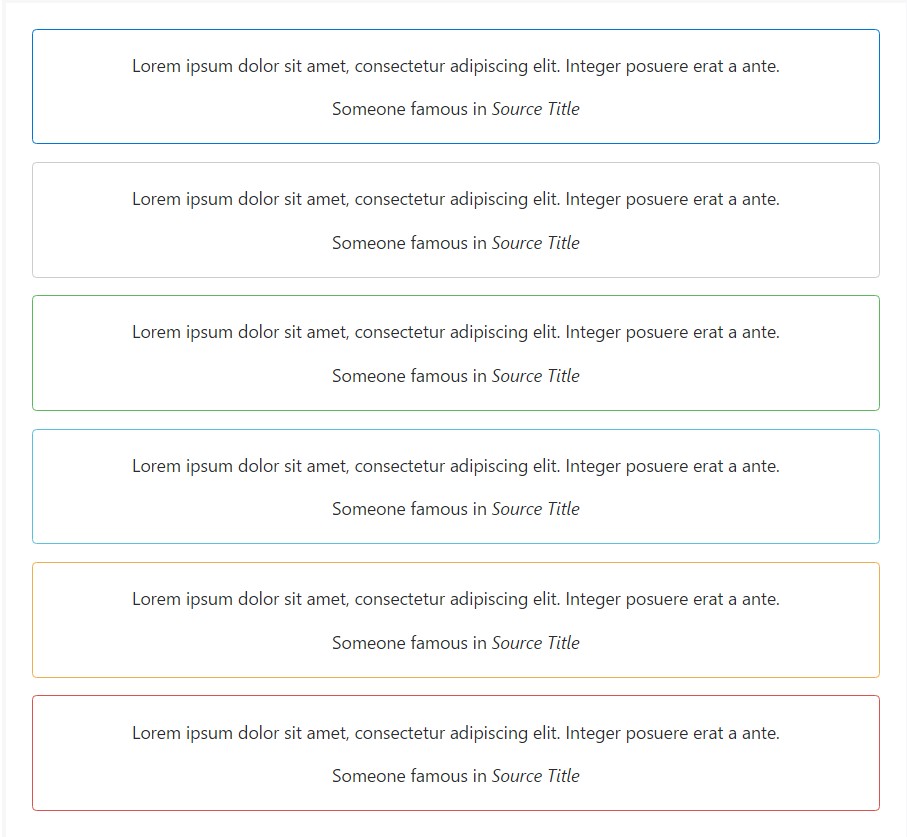
<div class="card card-outline-primary mb-3 text-center">
  <div class="card-block">
    <blockquote class="card-blockquote">
      <p>Lorem ipsum dolor sit amet, consectetur adipiscing elit. Integer posuere erat a ante.</p>
      <footer>Someone famous in <cite title="Source Title">Source Title</cite></footer>
    </blockquote>
  </div>
</div>
<div class="card card-outline-secondary mb-3 text-center">
  <div class="card-block">
    <blockquote class="card-blockquote">
      <p>Lorem ipsum dolor sit amet, consectetur adipiscing elit. Integer posuere erat a ante.</p>
      <footer>Someone famous in <cite title="Source Title">Source Title</cite></footer>
    </blockquote>
  </div>
</div>
<div class="card card-outline-success mb-3 text-center">
  <div class="card-block">
    <blockquote class="card-blockquote">
      <p>Lorem ipsum dolor sit amet, consectetur adipiscing elit. Integer posuere erat a ante.</p>
      <footer>Someone famous in <cite title="Source Title">Source Title</cite></footer>
    </blockquote>
  </div>
</div>
<div class="card card-outline-info mb-3 text-center">
  <div class="card-block">
    <blockquote class="card-blockquote">
      <p>Lorem ipsum dolor sit amet, consectetur adipiscing elit. Integer posuere erat a ante.</p>
      <footer>Someone famous in <cite title="Source Title">Source Title</cite></footer>
    </blockquote>
  </div>
</div>
<div class="card card-outline-warning mb-3 text-center">
  <div class="card-block">
    <blockquote class="card-blockquote">
      <p>Lorem ipsum dolor sit amet, consectetur adipiscing elit. Integer posuere erat a ante.</p>
      <footer>Someone famous in <cite title="Source Title">Source Title</cite></footer>
    </blockquote>
  </div>
</div>
<div class="card card-outline-danger text-center">
  <div class="card-block">
    <blockquote class="card-blockquote">
      <p>Lorem ipsum dolor sit amet, consectetur adipiscing elit. Integer posuere erat a ante.</p>
      <footer>Someone famous in <cite title="Source Title">Source Title</cite></footer>
    </blockquote>
  </div>
</div>
Card concept
Besides styling the material within cards, Bootstrap 4 includes a number of alternatives for laying out collection of cards. For the present being, these design choices are not yet responsive.
Card groups
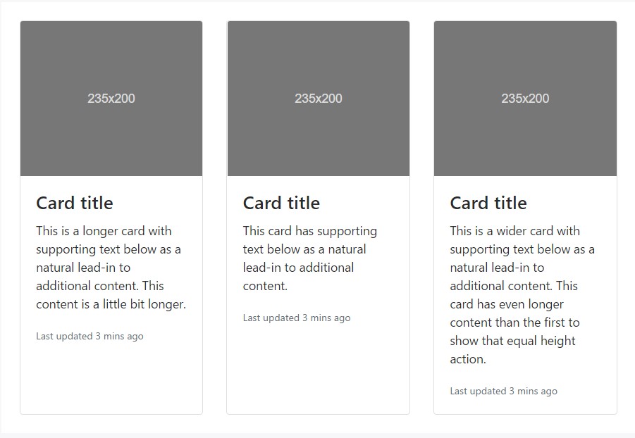
Utilize card groups to make cards as a single, connected element with identical width and height columns. Card groups work with display: flex; to accomplish their uniform sizing.
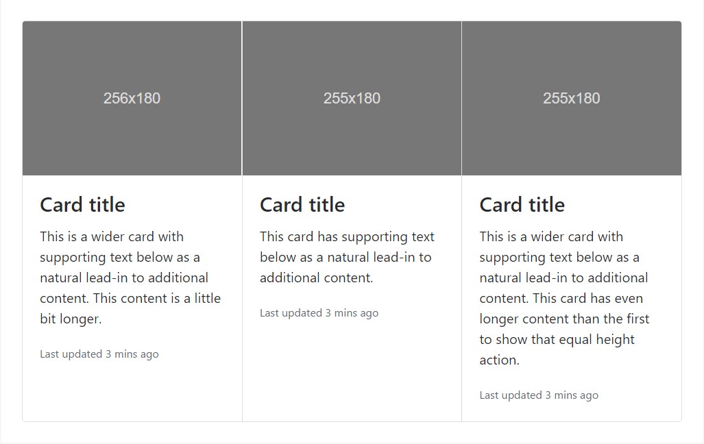
<div class="card-group">
  <div class="card">
    <div class="img"><img class="card-img-top" src="..." alt="Card image cap"></div>
    <div class="card-block">
      <h4 class="card-title">Card title</h4>
      <p class="card-text">This is a wider card with supporting text below as a natural lead-in to additional content. This content is a little bit longer.</p>
      <p class="card-text"><small class="text-muted">Last updated 3 mins ago</small></p>
    </div>
  </div>
  <div class="card">
    <div class="img"><img class="card-img-top" src="..." alt="Card image cap"></div>
    <div class="card-block">
      <h4 class="card-title">Card title</h4>
      <p class="card-text">This card has supporting text below as a natural lead-in to additional content.</p>
      <p class="card-text"><small class="text-muted">Last updated 3 mins ago</small></p>
    </div>
  </div>
  <div class="card">
    <div class="img"><img class="card-img-top" src="..." alt="Card image cap"></div>
    <div class="card-block">
      <h4 class="card-title">Card title</h4>
      <p class="card-text">This is a wider card with supporting text below as a natural lead-in to additional content. This card has even longer content than the first to show that equal height action.</p>
      <p class="card-text"><small class="text-muted">Last updated 3 mins ago</small></p>
    </div>
  </div>
</div>
When employing card groups with footers, their content is going to automatically line up.
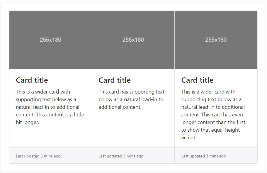
<div class="card-group">
<div class="card">
<div class="img"><img class="card-img-top" src="..." alt="Card image cap"></div>
<div class="card-block">
<h4 class="card-title">Card title</h4>
<p class="card-text">This is a wider card with supporting text below as a natural lead-in to additional content. This content is a little bit longer.</p>
</div>
<div class="card-footer">
<small class="text-muted">Last updated 3 mins ago</small>
</div>
</div>
<div class="card">
<div class="img"><img class="card-img-top" src="..." alt="Card image cap"></div>
<div class="card-block">
<h4 class="card-title">Card title</h4>
<p class="card-text">This card has supporting text below as a natural lead-in to additional content.</p>
</div>
<div class="card-footer">
<small class="text-muted">Last updated 3 mins ago</small>
</div>
</div>
<div class="card">
<div class="img"><img class="card-img-top" src="..." alt="Card image cap"></div>
<div class="card-block">
<h4 class="card-title">Card title</h4>
<p class="card-text">This is a wider card with supporting text below as a natural lead-in to additional content. This card has even longer content than the first to show that equal height action.</p>
</div>
<div class="card-footer">
<small class="text-muted">Last updated 3 mins ago</small>
</div>
</div>
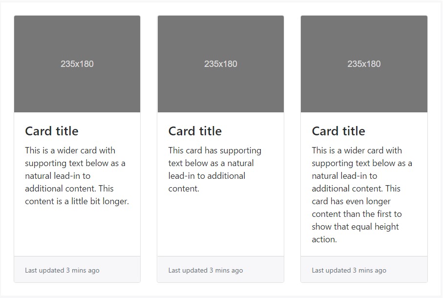
</div>Card decks
Required a collection of equal width as well as height cards that typically aren't affixed to one another? Utilize card decks.
<div class="card-deck">
  <div class="card">
    <div class="img"><img class="card-img-top" src="..." alt="Card image cap"></div>
    <div class="card-block">
      <h4 class="card-title">Card title</h4>
      <p class="card-text">This is a longer card with supporting text below as a natural lead-in to additional content. This content is a little bit longer.</p>
      <p class="card-text"><small class="text-muted">Last updated 3 mins ago</small></p>
    </div>
  </div>
  <div class="card">
    <div class="img"><img class="card-img-top" src="..." alt="Card image cap"></div>
    <div class="card-block">
      <h4 class="card-title">Card title</h4>
      <p class="card-text">This card has supporting text below as a natural lead-in to additional content.</p>
      <p class="card-text"><small class="text-muted">Last updated 3 mins ago</small></p>
    </div>
  </div>
  <div class="card">
    <div class="img"><img class="card-img-top" src="..." alt="Card image cap"></div>
    <div class="card-block">
      <h4 class="card-title">Card title</h4>
      <p class="card-text">This is a wider card with supporting text below as a natural lead-in to additional content. This card has even longer content than the first to show that equal height action.</p>
      <p class="card-text"><small class="text-muted">Last updated 3 mins ago</small></p>
    </div>
  </div>
</div>
Just like with card groups, card footers in decks should automatically line up.
<div class="card-deck">
  <div class="card">
    <div class="img"><img class="card-img-top" src="..." alt="Card image cap"></div>
    <div class="card-block">
      <h4 class="card-title">Card title</h4>
      <p class="card-text">This is a wider card with supporting text below as a natural lead-in to additional content. This content is a little bit longer.</p>
    </div>
    <div class="card-footer">
      <small class="text-muted">Last updated 3 mins ago</small>
    </div>
  </div>
  <div class="card">
    <div class="img"><img class="card-img-top" src="..." alt="Card image cap"></div>
    <div class="card-block">
      <h4 class="card-title">Card title</h4>
      <p class="card-text">This card has supporting text below as a natural lead-in to additional content.</p>
    </div>
    <div class="card-footer">
      <small class="text-muted">Last updated 3 mins ago</small>
    </div>
  </div>
  <div class="card">
    <div class="img"><img class="card-img-top" src="..." alt="Card image cap"></div>
    <div class="card-block">
      <h4 class="card-title">Card title</h4>
      <p class="card-text">This is a wider card with supporting text below as a natural lead-in to additional content. This card has even longer content than the first to show that equal height action.</p>
    </div>
    <div class="card-footer">
      <small class="text-muted">Last updated 3 mins ago</small>
    </div>
  </div>
</div>
Card columns
Cards may be arranged into Masonry-like columns with just CSS by wrapping them in .card-columns. Cards are built with CSS column properties instead of flexbox for simpler alignment. Cards are ordered from top to bottom and left to.
Carry on! Your mileage with card columns may differ. To prevent cards breaking across columns, set them to display: inline-block as column-break-inside: avoid isn't a bulletproof solution yet.
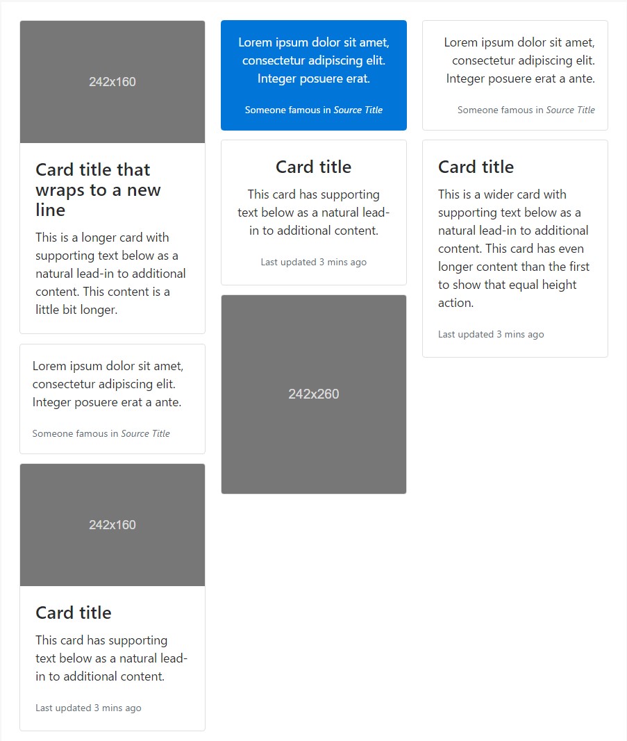
<div class="card-columns">
  <div class="card">
    <div class="img"><img class="card-img-top img-fluid" src="..." alt="Card image cap"></div>
    <div class="card-block">
      <h4 class="card-title">Card title that wraps to a new line</h4>
      <p class="card-text">This is a longer card with supporting text below as a natural lead-in to additional content. This content is a little bit longer.</p>
    </div>
  </div>
  <div class="card p-3">
    <blockquote class="card-block card-blockquote">
      <p>Lorem ipsum dolor sit amet, consectetur adipiscing elit. Integer posuere erat a ante.</p>
      <footer>
        <small class="text-muted">
          Someone famous in <cite title="Source Title">Source Title</cite>
        </small>
      </footer>
    </blockquote>
  </div>
  <div class="card">
    <div class="img"><img class="card-img-top img-fluid" src="..." alt="Card image cap"></div>
    <div class="card-block">
      <h4 class="card-title">Card title</h4>
      <p class="card-text">This card has supporting text below as a natural lead-in to additional content.</p>
      <p class="card-text"><small class="text-muted">Last updated 3 mins ago</small></p>
    </div>
  </div>
  <div class="card card-inverse card-primary p-3 text-center">
    <blockquote class="card-blockquote">
      <p>Lorem ipsum dolor sit amet, consectetur adipiscing elit. Integer posuere erat.</p>
      <footer>
        <small>
          Someone famous in <cite title="Source Title">Source Title</cite>
        </small>
      </footer>
    </blockquote>
  </div>
  <div class="card text-center">
    <div class="card-block">
      <h4 class="card-title">Card title</h4>
      <p class="card-text">This card has supporting text below as a natural lead-in to additional content.</p>
      <p class="card-text"><small class="text-muted">Last updated 3 mins ago</small></p>
    </div>
  </div>
  <div class="card">
    <div class="img"><img class="card-img img-fluid" src="..." alt="Card image"></div>
  </div>
  <div class="card p-3 text-right">
    <blockquote class="card-blockquote">
      <p>Lorem ipsum dolor sit amet, consectetur adipiscing elit. Integer posuere erat a ante.</p>
      <footer>
        <small class="text-muted">
          Someone famous in <cite title="Source Title">Source Title</cite>
        </small>
      </footer>
    </blockquote>
  </div>
  <div class="card">
    <div class="card-block">
      <h4 class="card-title">Card title</h4>
      <p class="card-text">This is a wider card with supporting text below as a natural lead-in to additional content. This card has even longer content than the first to show that equal height action.</p>
      <p class="card-text"><small class="text-muted">Last updated 3 mins ago</small></p>
    </div>
  </div>
</div>
Card columns can also be extended as well as personalized with some additional code. Revealed listed below is an expansion of the .card-columns class utilizing the very same CSS-- CSS columns-- to produce a set of responsive rates for changing the variety of columns.
.card-columns
  @include media-breakpoint-only(lg)
    column-count: 4;

  @include media-breakpoint-only(xl)
    column-count: 5;
Final thoughts
Generally this is the method the bright new to Bootstrap 4 card section becomes easily set up. As always aiming for ease and simplicity the new framework version combines the functionality of multiple sections into a powerful and single one. Now you should select the components you need to be included in some cards.
Take a look at a number of video clip guide about Bootstrap Panel Button:
Connected topics:
Bootstrap Panel-Cards: approved documents
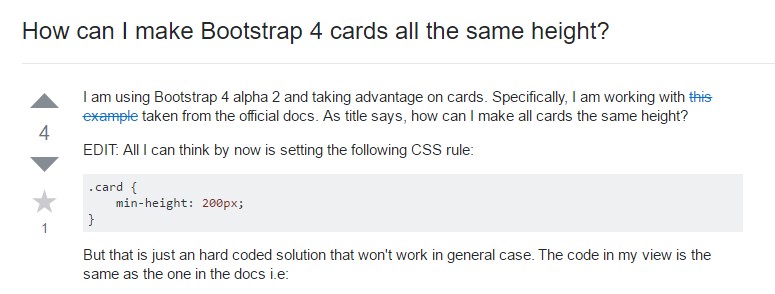
Insights on just how can we build Bootstrap 4 cards all the same tallness?
Having need of past panel look for cards