Bootstrap Login forms Modal
Overview
In some situations we really need to defend our priceless web content in order to give access to only specific people to it or else dynamically customise a part of our internet sites baseding upon the particular viewer that has been viewing it. However just how could we potentially know each particular visitor's persona due to the fact that there are so many of them-- we should get an straightforward and reliable approach getting to know who is who.
This is exactly where the site visitor access management comes along initially engaging with the website visitor with the so knowledgeable login form feature. Within current fourth edition of probably the most famous mobile friendly web page design framework-- the Bootstrap 4 we have a lots of features for creating this sort of forms and so what we are certainly planning to do here is taking a look at a detailed instance exactly how can a basic login form be produced using the convenient tools such as best online form builder the current edition comes along with.
Steps to utilize the Bootstrap Login forms Code:
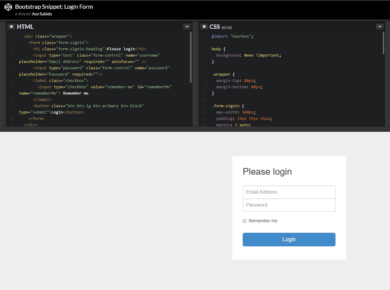
For starters we need to have a <form> element to wrap around our Bootstrap login form.
Inside of it several .form-group elements should be provided -- at least two of them actually-- one for the username or mail and one-- for the certain user's password.
Normally it's more helpful to work with individual's e-mail as opposed to making them identify a username to confirm to you due to the fact that generally anyone realises his e-mail and you can always ask your site visitors eventually to specifically provide you the approach they would like you to address them. So within the first .form-group we'll first place a <label> element with the .col-form-label class employed, a for = " ~ the email input which comes next ID here ~ " attribute and certain meaningful tip for the customers-- like " E-mail", "Username" or something.
Next we need an <input> element together with a type = "email" in the event we need the e-mail or type="text" in the event a username is wanted, a unique id=" ~ some short ID here ~ " attribute together with a .form-control class installed on the component. This will produce the field in which the users will give us with their mails or usernames and in the event it is actually emails we're talking about the browser will also check of it's a legitimate e-mail added due to the type property we have determined.
Next comes the .form-group in which the password should be provided. As usual it should first have some kind of <label> prompting what's needed here caring the .col-form-label class, some meaningful text like "Please enter your password" and a for= " ~ the password input ID here ~ " attribute pointing to the ID of the <input> element we'll create below.
After that arrives the .form-group through which the password should be given. As usual it must primarily have some sort of <label> prompting what is really required here carrying the .col-form-label class, some meaningful content such as "Please enter your password" and a for= " ~ the password input ID here ~ " attribute indicating the ID of the <input> element we'll create below.
Next we need to put an <input> with the class .form-control and a type="password" attribute so we get the prominent thick dots visual appeal of the characters typed inside this field and certainly-- a unique id= " ~ should be the same as the one in the for attribute of the label above ~ " attribute to fit the input and the label above.
Ultimately we really need a <button> element in order the site visitors to be able submitting the references they have simply just provided-- make sure you appoint the type="submit" property to it.
Example of login form
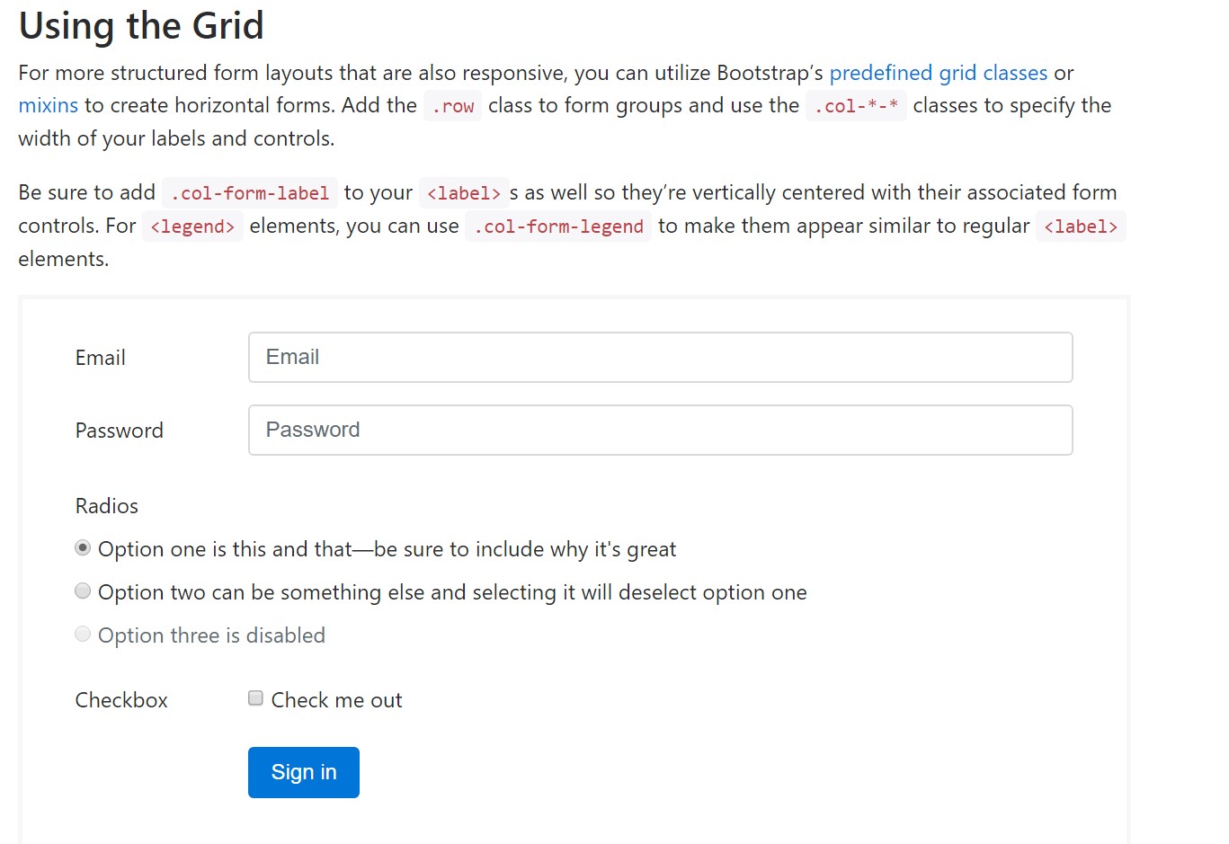
For additionally structured form layouts that are also responsive, you can absolutely incorporate Bootstrap's predefined grid classes as well as mixins to make horizontal forms. Put in the . row class to form groups and utilize the .col-*-* classes to specify the width of your labels and controls.
Don't forget to add in .col-form-label to your <label>-s as well and so they're upright centralized with their attached form controls. For <legend> elements, you have the ability to use .col-form-legend to make them show up the same as standard <label> features.
<div class="container">
<form>
<div class="form-group row">
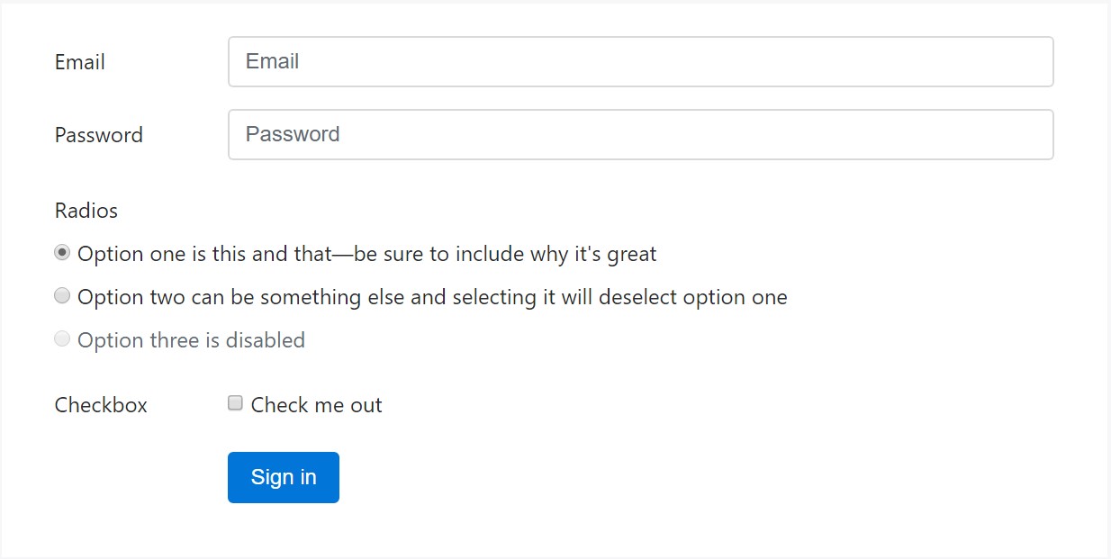
<label for="inputEmail3" class="col-sm-2 col-form-label">Email</label>
<div class="col-sm-10">
<input type="email" class="form-control" id="inputEmail3" placeholder="Email">
</div>
</div>
<div class="form-group row">
<label for="inputPassword3" class="col-sm-2 col-form-label">Password</label>
<div class="col-sm-10">
<input type="password" class="form-control" id="inputPassword3" placeholder="Password">
</div>
</div>
<fieldset class="form-group row">
<legend class="col-form-legend col-sm-2">Radios</legend>
<div class="col-sm-10">
<div class="form-check">
<label class="form-check-label">
<input class="form-check-input" type="radio" name="gridRadios" id="gridRadios1" value="option1" checked>
Option one is this and that—be sure to include why it's great
</label>
</div>
<div class="form-check">
<label class="form-check-label">
<input class="form-check-input" type="radio" name="gridRadios" id="gridRadios2" value="option2">
Option two can be something else and selecting it will deselect option one
</label>
</div>
<div class="form-check disabled">
<label class="form-check-label">
<input class="form-check-input" type="radio" name="gridRadios" id="gridRadios3" value="option3" disabled>
Option three is disabled
</label>
</div>
</div>
</fieldset>
<div class="form-group row">
<label class="col-sm-2">Checkbox</label>
<div class="col-sm-10">
<div class="form-check">
<label class="form-check-label">
<input class="form-check-input" type="checkbox"> Check me out
</label>
</div>
</div>
</div>
<div class="form-group row">
<div class="offset-sm-2 col-sm-10">
<button type="submit" class="btn btn-primary">Sign in</button>
</div>
</div>
</form>
</div>Conclusions
Generally these are the fundamental components you'll require in order to make a simple Bootstrap Login forms Layout with the Bootstrap 4 framework. If you're after some more complicated presences you are simply free to take a complete advantage of the framework's grid system setting up the elements practically any way you would think they should take place.
Review a couple of youtube video information regarding Bootstrap Login forms Code:
Linked topics:
Bootstrap Login Form official information
Article:How To Create a Bootstrap Login Form
One more example of Bootstrap Login Form